
YABBD: Yet Another Battle Board Design


So I've uh... made a few of these. And this is by no means the last. To catch you up a bit... here's the last one I did before CampOut last year and have updated a touch since then:

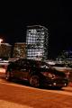
Annnnnd... the latest from this evening (still tweaking though):

Wanted to incorporate Corbeau in some way and also brought in some more color. And the SL thing is just a mock up of the new "logo" on the beta site. I'm waiting to see if they'll send me the real deal... cause mine is f'd up.
Annnnnd... the latest from this evening (still tweaking though):
Wanted to incorporate Corbeau in some way and also brought in some more color. And the SL thing is just a mock up of the new "logo" on the beta site. I'm waiting to see if they'll send me the real deal... cause mine is f'd up.


Originally Posted by ScionJim23
O, I didn't even see the Ikona on there....Yea, Not feeling his advertising on there...lol
I like the first layout better btw

Ha... ya, what name would you prefer I use? That's just what I've seen someone else call it. 
I am actually not happy with the header yet. I put the System font up there for the hell of it but I have to play around with that tonight.
I'm really not sure what to do about the iKona thing though b/c that's really what they are - even if the guy is a terrible "vendor."
I am actually not happy with the header yet. I put the System font up there for the hell of it but I have to play around with that tonight.
I'm really not sure what to do about the iKona thing though b/c that's really what they are - even if the guy is a terrible "vendor."
So here are a couple more options for the header... (I really don't care for the old header either).


Thoughts? I think the "silver streak mica" part of it wasn't really helping things with the red border.
Thoughts? I think the "silver streak mica" part of it wasn't really helping things with the red border.

have you tried making the light blue into that dark royal blue color you have on the top banner and changing the text to white? maybe that will make it flow better. its just the light blue makes it off a little
