
Attention all Team Ascension members


Thread Starter
Senior Member
Balliztik
SL Member
Joined: Mar 2006
Posts: 3,578
From: Olympia, WA
OK please don't get mad at me for saying this but here i go 
Well i visited the page that is selling our team gear and well more and more i look at it the more and more i think that they look blah and plain no pop no flavor no nothing just plain jane so i got to think i know Mo what it is going to take to do all the changes but it is just an idea, but anyways thanks to Miss B and the website she has given me I've been playing around with different fonts and styles that we can use for maybe shirt logos, car banners (front and back) and maybe even a complete change in the logo for TA.
Since alot of you visit this site more then the other (TA Page) this is where i am going to post it for now i did make a folder for some that i might think will work so i will post the link if anyone is interested now please don't get mad at me for saying this but i want our team name to stand out and i know alot of us just got new stickers and all but you can still roll with them but i just think we need something that stands out more but anyways heres how the link work i will post the link and if it doesn't come up saying Team Ascension then where it says Custom preview type it in there and then click submit. there are a few fonts on there that i added because i wanted to throw a few random ones in there for certain people to get a kick out of and they are not numbered but if you tell me what type of font it is like example the first one is called (Aaaiight!) and so forth so anyways if you guys like any of them just post your fav's because i will be adding more and see what we all like and come up with. thanks and later
Mo and Coryann please don't get mad at me for this but i know you guys did alot of work coming up with the logo for our club but i am just trying to update it to make it stand out more.
thanks Brad aka importspeed
here is the link
http://www.dafont.com/pselect.php?folder_id=37907

Senior Member
Balliztik
SL Member
Joined: Jun 2007
Posts: 9,538
From: Washington
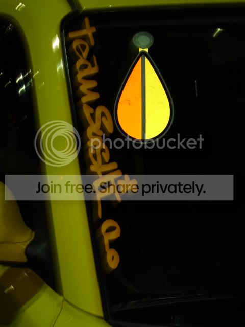
I do not like any of them.........problem with a logo is it has to be readable while you are in a car driving.........the currant logo is easy to read........perhaps we need to keep looking or I can try to design one........I like the grey and orange logo though as it stands out as not a car part.........
Senior Member
Balliztik
SL Member
Joined: Nov 2006
Posts: 1,405
From: Renton, Wa
i have to agree with Brian, i like the current logo, its clean and simple....maybe for the safe press merch do the other ideas, but for the cars, i def like the clean cut design we currently have
Senior Member
SL Member
Joined: Nov 2007
Posts: 852
From: Marysville, CA
street soul one is cool
but graffonti is way cool. the outlined t and A the rest black filled in lettering. but with this font change the front one to orange and keep the black lettering
not a ta member just showing what i think is cool looking
but graffonti is way cool. the outlined t and A the rest black filled in lettering. but with this font change the front one to orange and keep the black lettering
not a ta member just showing what i think is cool looking
Thread Starter
Senior Member
Balliztik
SL Member
Joined: Mar 2006
Posts: 3,578
From: Olympia, WA
LOL well there is a few of us not going to say names would like a logo change but if you want to go and play around with other fonts on the page those are just ideas and plus you may like the way it looks but to some well they like it to stand out and be out there. sorry brian i just would like it to look different. it looks to plain and not enuff pop but i will keep playing around with others, oh yeah these could be like shirt designs also not just car stickers

Thread Starter
Senior Member
Balliztik
SL Member
Joined: Mar 2006
Posts: 3,578
From: Olympia, WA
brain just go in there and check out the other fonts i said that those are just some random ones i sorta like LOL
it is a cool website to mess around with plus it just gives you ideas on stuff
it is a cool website to mess around with plus it just gives you ideas on stuff


Thread Starter
Senior Member
Balliztik
SL Member
Joined: Mar 2006
Posts: 3,578
From: Olympia, WA
sweet like i said it just gives us an idea on maybe changing it so something that stands out more and gives it that pop or flair see i am thinking more of a banner like on the front and back or just the front.

Senior Member
SL Member
Joined: Jun 2006
Posts: 873
From: Newark, CA; Auburn, WA
Brad, I am not mad in fact I am glad to see members trying to improve their club! CoreyAnn and I would rather be facilitators and help make things happen, not the dictators of TA who make arbitrary decisions. TA belongs to its members and it is up to you guys to help make it better. As long as everyone agrees on the changes and is willing to pay for the logo changes it is not an issue. Keep in mind that this means new decals which are about $2.50 a piece and those who spent money on merchandise with our current logos will be upset. Plus new banners, letter head and other added costs.
Thanks for taking the initiative on this issue!
Thanks for taking the initiative on this issue!
Thread Starter
Senior Member
Balliztik
SL Member
Joined: Mar 2006
Posts: 3,578
From: Olympia, WA
hey if you guys want you can tell me which ones in the folder you hate and like and which ones i should get rid of or keep and also ones that you guys like and i should add to the folder
oh yeah please dont say all of them aka brian LOL
and i will try to keep that folder up to date with everyones request and then when time comes to pick a new team font style at least will have an idea what everyone likes
thanks
oh yeah please dont say all of them aka brian LOL
and i will try to keep that folder up to date with everyones request and then when time comes to pick a new team font style at least will have an idea what everyone likes
thanks
Thread Starter
Senior Member
Balliztik
SL Member
Joined: Mar 2006
Posts: 3,578
From: Olympia, WA
here is the link
http://www.dafont.com/pselect.php?folder_id=37907
just remember to type in Team Ascension where is says custom preview to get an idea what it will look like thanks
http://www.dafont.com/pselect.php?folder_id=37907
just remember to type in Team Ascension where is says custom preview to get an idea what it will look like thanks
