Notices

A Look at Toyota & Scion Logos

Thread Tools
 
Search this Thread
 
Old 07-09-2008, 10:10 PM
  #1  
Senior Member
10 Year Member
5 Year Member
SL Member
Thread Starter
 
ScionicXTC's Avatar
 
Join Date: Jun 2004
Location: Sacramento, CA
Posts: 327
Default A Look at Toyota & Scion Logos

There was a recent article on Toyota’s corporate blog providing the meaning behind the Toyota logo. In the spirit of their explanation, we think you’d be interested in some information about the Scion logo as well…

http://scionnews.net/2008/07/09/a-lo...a-scion-logos/
ScionicXTC is offline  
Old 07-09-2008, 10:54 PM
  #2  
Senior Member
10 Year Member
5 Year Member
SL Member
 
neodemon278's Avatar
 
Join Date: Sep 2007
Location: Plainfield, Indiana
Posts: 104
Default

that was a petty good read, always wonder what the logos meant
neodemon278 is offline  
Old 07-09-2008, 10:56 PM
  #3  
Senior Member
10 Year Member

5 Year Member
Fail, INC

SL Member
 
Big_Bird's Avatar
 
Join Date: Apr 2005
Location: North NJ / PSU
Posts: 12,401
Default

Wow Toyota put a lot of thought into their logo.
Big_Bird is offline  
Old 07-09-2008, 11:51 PM
  #4  
Senior Member
10 Year Member
5 Year Member
SL Member
 
MoScion's Avatar
 
Join Date: Jun 2006
Location: Newark, CA; Auburn, WA
Posts: 873
Default

The Toyota logo was deep, I expected more from Scion after reading and thinking about
Toytoa.
MoScion is offline  
Old 07-10-2008, 12:54 AM
  #5  
Member
10 Year Member
5 Year Member
SL Member
 
SciRunner's Avatar
 
Join Date: May 2007
Posts: 92
Default

IMO, the Scion logo is a combination of the Toyota Sienta (the "S") and Hino logo

The "S" on the hood and possible closed ellipse with SIENTA lettering


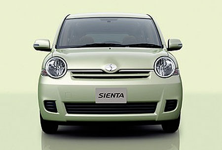
The bar in the middle for SCION and/or the nearly closed ellipse.


SciRunner is offline  
Old 07-10-2008, 02:46 AM
  #6  
Senior Member
10 Year Member
5 Year Member
Scikotics
SL Member
 
menace549's Avatar
 
Join Date: Nov 2006
Location: Indy Scikotics
Posts: 172
Default

I think the Hino "bar" is for connecting the broken ellipse to form an H, for Hino. But when you put the two together I can see where you're coming from.
menace549 is offline  
Old 07-10-2008, 07:06 AM
  #7  
Junior Member
 
wherediputit's Avatar
 
Join Date: Aug 2007
Location: Las Vegas, NV
Posts: 2
Default

I did a study on the Toyota logo a couple months back, for a class I had. And I did find the article informative, but I think a hidden aspect or maybe purely coincidental aspect of the Toyota logo is the ability to make up every letter of Toyota from it. A link is below showing it blown out, Kind of crudely done, but you get the idea.


http://farm4.static.flickr.com/3253/...14cf2010_o.jpg
wherediputit is offline  
Old 07-10-2008, 05:49 PM
  #8  
Member
10 Year Member
5 Year Member
SL Member
 
djfooboo's Avatar
 
Join Date: Dec 2007
Posts: 79
Default

This website has some pretty neat stuff to browse. It is an internet museum of car typography, but it has lots of other interesting stuff.

http://www.cartype.com/
djfooboo is offline  
Old 07-10-2008, 08:54 PM
  #9  
Senior Member
10 Year Member
5 Year Member
SL Member
Scion Evolution
iTrader: (1)
 
WAlterEgo's Avatar
 
Join Date: Jul 2007
Location: Chicago, IL
Posts: 1,381
Default

interesting backstory of the toyota logo
WAlterEgo is offline  
Old 07-11-2008, 01:59 PM
  #10  
Senior Member
10 Year Member

5 Year Member
SL Member
iTrader: (11)
 
highvoltage1's Avatar
 
Join Date: Mar 2007
Location: Tampa area
Posts: 6,550
Default

cool info.
highvoltage1 is offline  
Old 07-13-2008, 01:22 AM
  #11  
Senior Member
10 Year Member
5 Year Member

SL Member
Scinergy
 
hotweelz4me's Avatar
 
Join Date: May 2006
Location: Jacksonville, FL
Posts: 1,121
Default

The info on the Toyota emblem is great, but the Scion info was lacking and left me feeling disapointed in the lack of a good read.
hotweelz4me is offline  
Old 07-15-2008, 06:27 AM
  #12  
Junior Member
 
Dirtyred's Avatar
 
Join Date: Jan 2008
Location: nicholasville, ky
Posts: 26
Default

i've always thought the scion logo looked like 2 shark fins.
Dirtyred is offline  
Old 07-16-2008, 03:07 PM
  #13  
Senior Member
10 Year Member
5 Year Member

Scikotics
SL Member
Scinergy
 
grizzly_choppers's Avatar
 
Join Date: Jul 2004
Location: Wilson Scion (IA)
Posts: 2,235
Default

Even more interesting to me was some information I was recently given on the name Toyota itself. The family last name is actually Toyoda as many of you know. There are actually several reasons it was changed including humility, the strong sound of the "t", and even the number of brush strokes it takes to write ("Toyota" takes 8 strokes ant that is considered lucky). There is even a reason stating that the first character for Toytoa when writing it looks like Mt. Fuji and even THAT is lucky.

I'm not sure I buy every one of the reasons I was told or even all of the reasons outlined for the current Toyota symbol. I have a stong feeling that there is a PR agency somewhere that thinks this stuff up for the company.

Still, its interesting to learn.

-Alex
grizzly_choppers is offline  
Old 07-17-2008, 02:59 AM
  #14  
Senior Member
10 Year Member
5 Year Member
SL Member
iTrader: (3)
 
x_Batman_x's Avatar
 
Join Date: Feb 2007
Location: New Orleans
Posts: 2,111
Default

good read. good to see that thought went into the logo... however no matter how hard I try it always just looks like a cowboy in a circle :-/
x_Batman_x is offline  
Old 07-23-2008, 01:05 PM
  #15  
Senior Member
10 Year Member
5 Year Member
OhioScions
SL Member
 
crabbyman's Avatar
 
Join Date: Sep 2006
Location: Ohio
Posts: 188
Default

For some reason I seem to remember a commercial Toyota used in the 90's that said something about "bull horns". I googled it and all I can find is a Dodge slogan.

Anyways...I have always seen the logo as a sort of bull..with horns. The vertical oval being the front view of the bull and the horizontal oval being the horns.
crabbyman is offline  
Old 08-05-2008, 10:36 PM
  #16  
Member
10 Year Member
SL Member
 
HackSacken's Avatar
 
Join Date: Oct 2006
Posts: 17
Default

Originally Posted by hotweelz4me
The info on the Toyota emblem is great, but the Scion info was lacking and left me feeling disapointed in the lack of a good read.
I concur.
HackSacken is offline  
Old 08-07-2008, 04:46 PM
  #17  
Senior Member
10 Year Member
5 Year Member
SL Member
Thread Starter
 
ScionicXTC's Avatar
 
Join Date: Jun 2004
Location: Sacramento, CA
Posts: 327
Default

Check the article again (updated) ...there is no meaning to the Scion logo like there is for the Toyota logo.

http://scionnews.net/2008/07/09/a-lo...a-scion-logos/
ScionicXTC is offline  
Old 08-07-2008, 05:34 PM
  #18  
Senior Member
10 Year Member
5 Year Member
SL Member
 
IntegreS_350's Avatar
 
Join Date: Jul 2007
Location: San Gabriel, CA
Posts: 3,294
Default

^^^ Ohh are you Eric?
IntegreS_350 is offline  
Old 08-07-2008, 05:51 PM
  #19  
Senior Member
10 Year Member
5 Year Member
SL Member
Thread Starter
 
ScionicXTC's Avatar
 
Join Date: Jun 2004
Location: Sacramento, CA
Posts: 327
Default

Yep. I've tried to change my username on here, but my request went unanswered.
ScionicXTC is offline  
Old 08-07-2008, 06:01 PM
  #20  
Senior Member
10 Year Member
5 Year Member
SL Member
 
IntegreS_350's Avatar
 
Join Date: Jul 2007
Location: San Gabriel, CA
Posts: 3,294
Default

Oohhh haha I was the one who chatted with you today! Sorry again that took so long-- I had to hunt down a manger =]
IntegreS_350 is offline  


Quick Reply: A Look at Toyota & Scion Logos


All times are GMT. The time now is 05:48 PM.