What do you think of these graphics.......


 08-10-2007, 05:57 PM
#6
Senior Member
Team ScionEyed
SL Member
iTrader: (1)

Join Date: Sep 2005
Location: Houston, TX
Posts: 3,703
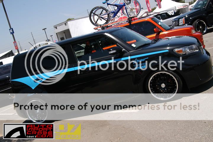
Someone got some crackers to go with that cheeziness 
Dont really like it, seems out of place. Looks like the front should line up with the fender and it looks like the front should come up a lil more to be even with the body lines
Dont really like it, seems out of place. Looks like the front should line up with the fender and it looks like the front should come up a lil more to be even with the body lines
08-10-2007, 06:30 PM
#9
Senior Member
SL Member
Scinergy

Join Date: Jan 2006
Location: Castle Rock, Colorado
Posts: 4,088
I really like the Blue on the white! I would have to agree with Taco about that now that he said to put it higher. But I wouldn't change it if it was mine. I really like the back, very nice.
 [/img]

 08-10-2007, 07:06 PM
#14
Senior Member
SL Member

Join Date: May 2007
Posts: 279
Originally Posted by tCTaco
Dont really like it, seems out of place. Looks like the front should line up with the fender and it looks like the front should come up a lil more to be even with the body lines

 08-10-2007, 08:21 PM
#17
Senior Member
SL Member
Scinergy
Join Date: Jan 2006
Location: Castle Rock, Colorado
Posts: 4,088
Originally Posted by toronado
Originally Posted by tCTaco
Dont really like it, seems out of place. Looks like the front should line up with the fender and it looks like the front should come up a lil more to be even with the body lines
 08-10-2007, 10:19 PM
#20
Senior Member

SL Member
Team ScioNRG

Join Date: Feb 2004
Location: Fortress of ScioNRG
Posts: 5,274
Originally Posted by Frosty355
Originally Posted by toronado
Originally Posted by tCTaco
Dont really like it, seems out of place. Looks like the front should line up with the fender and it looks like the front should come up a lil more to be even with the body lines
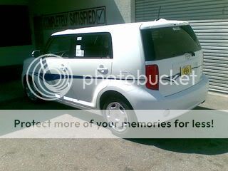
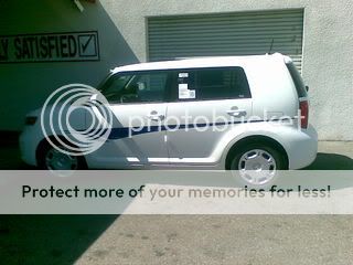
the ONLY thing differnt is a single backup lamp...everything else is symmetrical...
no wierd hump in rear glass like a range rover...no offset license plate...
even the scion logo,rear wipper and antenna are balanced
the nissan cube is asym....

